Part 5: Building a visualization with Observable
Introduction
In this part of the tutorial, we'll make a dynamic Observable visualization that uses your Seafowl deployment to execute queries:
(if you're too lazy, you can click this link to experiment with the final result)
Set up Observable
Sign up for Observable and create a new blank notebook.
Use the Seafowl database client
Note the hostname of your Seafowl deployment. If you followed the
Varnish branch of the tutorial, it will be,
for example, https://seafowl-varnish.fly.io. If you followed the
Cloudflare branch, it will be, for example,
https://seafowl.yourdomain.io.
We provide a database client for Seafowl that is compatible with Observable's DatabaseClient specification. To use it, add two JavaScript cells to your notebook as follows:
import { SeafowlDatabase } from "@seafowl/client";
// Replace the host with your deployment
database = new SeafowlDatabase({ host: "https://demo.seafowl.io" });
You can now use Observable's database browsing functionality with Seafowl.
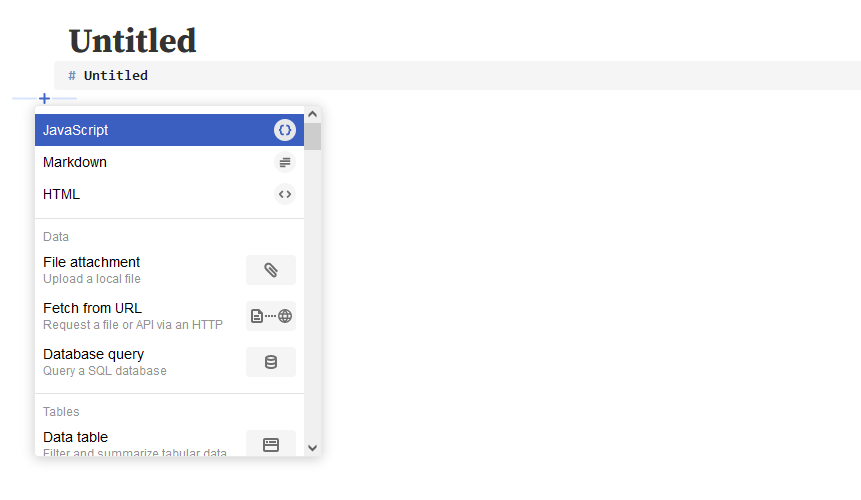
Add a data table
Let's run a simple SQL query from Observable. Create a new "Database Query" cell:
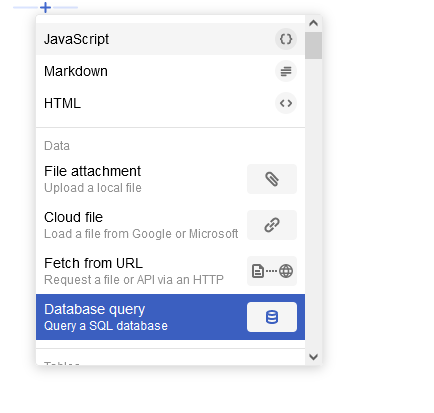
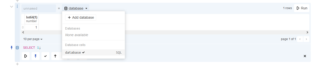
Select database in the dropdown:
You can now get query results from Seafowl into Observable. Let's summarize our dataset by getting the total export volume of all commodities by their country of production:
SELECT country_of_production,
  commodity,
  SUM(volume) AS total_volume
FROM supply_chains_copy
GROUP BY 1, 2
ORDER BY 3 DESC;
Run the query. You should see a table with results as follows:
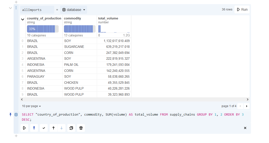
Name the cell allImports.
Add a plot
Create a new JavaScript cell and paste this code in it. This will use the Plot
library1 to visualize the data in our allImports table:
Plot.plot({
  height: 400,
  width: 900,
  marginLeft: 100,
  grid: true,
  x: {
    axis: "top",
    label: "Commodity",
  },
  y: {
    label: "Country",
  },
  color: {
    scheme: "PiYG",
  },
  marks: [
    Plot.cell(allImports, {
      x: "commodity",
      y: "country_of_production",
      fill: "total_volume",
    }),
    Plot.text(allImports, {
      x: "commodity",
      y: "country_of_production",
      text: (d) => d.total_volume?.toFixed(0),
      title: "total_volume",
    }),
  ],
});
You should now see a plot of all producing countries and the total volume of commodity exports in the source dataset:
Add dynamic filters
We'll now build something more complex that will showcase the benefits of using Seafowl. We'll create some notebook cells that will:
- Display a dropdown of all available countries of production
- Based on the selected country, show a dropdown of all available import countries
- Based on the selected country pair, show all available commodities
- Plot the top exporters and how the total export volume changed over time
Let's get the data for our dropdowns. Create the following cells:
All available countries of production:
productionCountries = database.sql`
SELECT DISTINCT(country_of_production) AS c
FROM supply_chains ORDER BY 1 ASC
`.then((r) => r.map((r) => r.c));
Dropdown to select from them:
viewof productionCountry = Inputs.select(productionCountries, {label: "Country of production"})
Countries that import from the selected country2:
importCountries = database.sql`
SELECT DISTINCT(country_of_import)
AS c FROM supply_chains
WHERE country_of_production = ${productionCountry}
ORDER BY 1 ASC
`.then((r) => r.map((r) => r.c));
Dropdown to select from them:
viewof importCountry = Inputs.select(importCountries, {
  label: `Country of import from ${productionCountry}`
})
All commodities traded between the selected production and import countries:
commodities = database.sql`
SELECT DISTINCT(commodity) AS c
FROM supply_chains
WHERE country_of_production = ${productionCountry}
AND country_of_import = ${importCountry}
ORDER BY 1 ASC
`.then((r) => r.map((r) => r.c));
Another dropdown to select from them:
viewof commodity = Inputs.select(commodities, {label: `Commodity exports from ${productionCountry} to ${importCountry}`})
Get data based on the filters
Whew! Now we have three dropdowns (productionCountry, importCountry and
commodity). We can use the values selected in them to create queries
dynamically:
Top exporters:
topExporters = database.sql`
SELECT exporter, SUM(volume) AS total_volume
FROM supply_chains
WHERE country_of_production = ${productionCountry}
AND country_of_import = ${importCountry}
AND commodity = ${commodity}
GROUP BY 1 ORDER BY 2 DESC LIMIT 20`;
Export volume by year:
volumeByYear = database.sql`
SELECT year::integer AS year,
SUM(volume) AS total_volume
FROM supply_chains
WHERE country_of_production = ${productionCountry}
AND country_of_import = ${importCountry}
AND commodity = ${commodity}
GROUP BY 1 ORDER BY 1 ASC`;
Plot the data
Finally, we can use these data cells to make some actual plots:
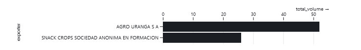
Top exporters:
topExportersP = Plot.plot({
  marginLeft: 300,
  x: {
    axis: "top",
    grid: true,
  },
  y: {
    domain: topExporters.map((d) => d.exporter),
  },
  marks: [
    Plot.barX(topExporters, {
      x: "total_volume",
      y: "exporter",
    }),
  ],
});
Export volume by year:
volumeByYearP = Plot.plot({
  x: { tickFormat: d3.format(",.0f") },
  marks: [Plot.line(volumeByYear, { x: "year", y: "total_volume" })],
});
You should now see two graphs:
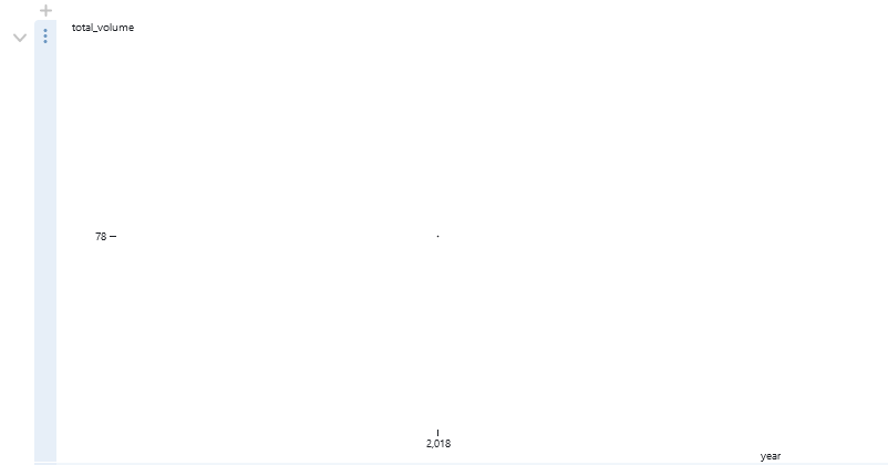
Don't worry about the second volume chart. The default dropdown values (Argentina, Afghanistan, Corn) only result in a single year of data (2018).
Experiment with dropdowns
One benefit of using Observable is that every cell is "live": an update to a single cell instantly propagates to all of its dependencies.
Change the "Country of production" dropdown to "COLOMBIA" (you can also do it right here). You should see the next dropdown, "Country of import", update to reflect all available importing countries. It'll also update the two charts to reflect the data from the new defaults.
Observe caching
There's one last thing we need to see. Open your browser's Developer Tools (F12) and click on the Network tab. Switch the dropdowns back to their old values ( Argentina, Afghanistan, Corn) and look at the outbound requests to Seafowl.
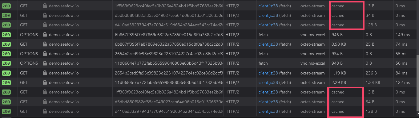
You should see that some of the outbound requests were cached by your browser. This is because the Observable client uses the cached GET API we discussed in a previous part. Instead of rerunning the queries, their results are loaded straight from the browser cache, making the dashboard snappier.
But that's not all. Tick "Disable Cache" to disable the browser cache and switch the dropdown values around again. Inspect the requests to your Seafowl deployment. You should see response headers from the cache you previously added to Seafowl:
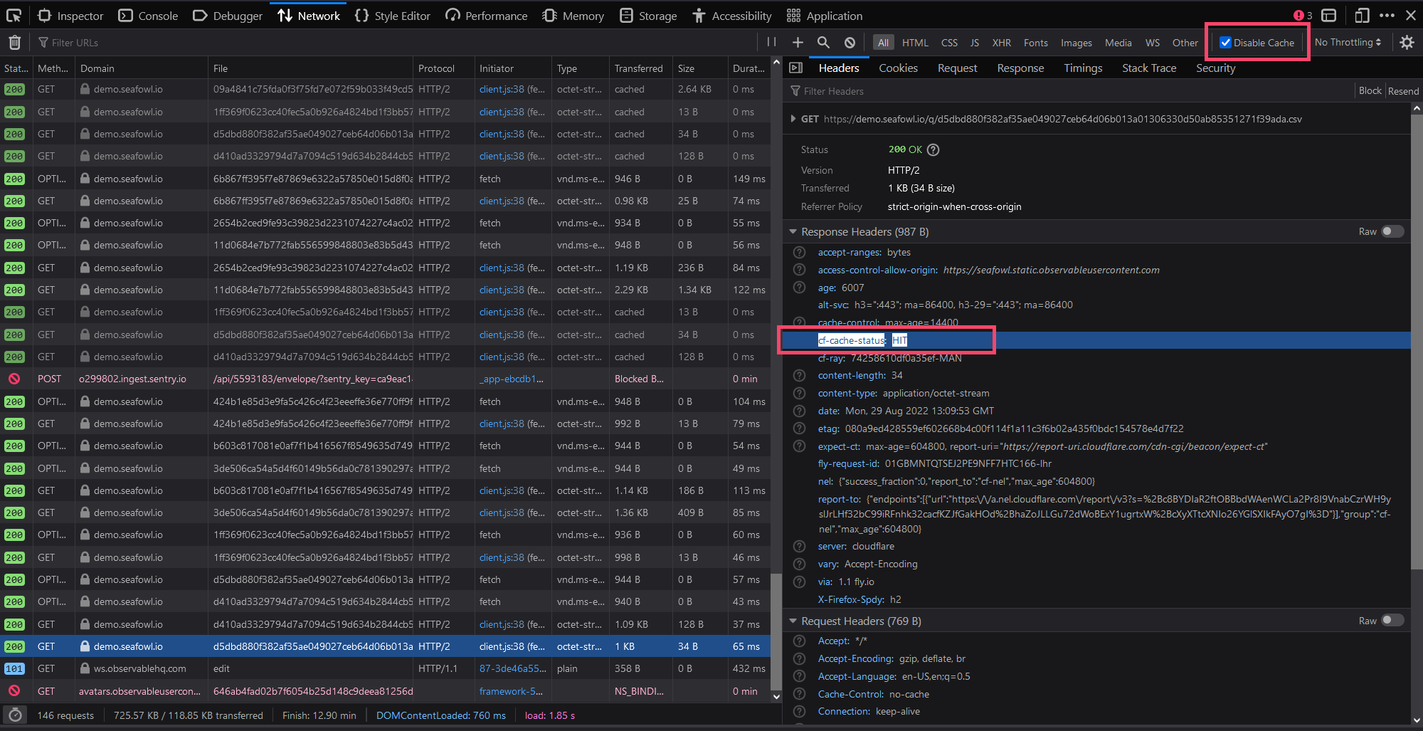
With Cloudflare, you'll see CF-Cache-Status: HIT and with Varnish, you'll see
X-Cache: hit cacheable. This means that popular queries from your dashboard
will get served immediately from the cache instead of getting rerun by Seafowl.
In case of a CDN, they will even be served from a location closer to your
visitor.
In either case, this will vastly decrease the latency of querying the data and the load on your Seafowl instance.
Conclusion and next steps
It's been a long journey! We went from nothing to having a dynamic and interactive visualization of a large dataset, available to anyone in the world in milliseconds.
Now that you're an intermediate Seafowl user, there are other things you can do:
- Try out some scaling methods, like using PostgreSQL and Minio or baking data into a Docker image
- Upload or query more file formats from Seafowl, for example, CSV
- Compile a user-defined function to WASM and run it on Seafowl
- Learn more about how Seafowl stores data
- Browse Seafowl's source code on GitHub
- See the Observable Plot Cheatsheets for more details.↩
- The
${...}syntax to interpolate values into queries might scream "SQL injection", but 1) well, we're running SQL queries from the client side anyway; 2) the Seafowl Observable client correctly escapes values when interpolating (try querying data for Cote D'Ivoire).↩

