Splitgraph has been acquired by EDB! Read the blog post.
Building a data-driven app with Splitgraph and Streamlit
We demonstrate how combining Splitgraph and Streamlit lets devs and data scientists more easily build data-driven apps. In this example we plot NYC subway turnstile data to try and glean how NYC's Covid recovery is going.
Introduction
Data-driven apps like interactive dashboards offer a valuable way for users to more easily draw individual conclusions backed by data. However, delivering those benefits may require significant cross-discipline engineering skills: backend, frontend, data ingestion/pipeline, DevOps and potentially infra to run all of it.
In this post we illustrate how Splitgraph helps lower barriers for data-driven apps by addressing key pain points. The Splitgraph DDN integrates smoothly with anything that speaks Postgres, and oftentimes reduces the need to stand up and maintain infra.
Today we will:
- upload a CSV to a Splitgraph repo
- use SQL to query the repo via the DDN
- use Python to parameterize the queries and do basic aggregations
- tie it all together with Streamlit in a rich web UI
Dashboard idea: How is NYC's Covid recovery going?
To answer this question one might consider various year-over-year data, e.g. real estate occupancy rates, sales tax revenue, or Broadway ticket sales.
How about public transit? NYC has one of the world's largest metro systems, and it turns out turnstile activity is regularly published by the MTA. While not every New Yorker uses the subway, many consider it vital, and such data could serve as a reasonable indicator of whether city life is back to pre-pandemic levels (spoiler: or not, as it turns out).
OK, we've got a dashboard goal! Let's plot data for NYC's most popular subway stations, by month, across 2020, 2021, and 2022.
I assume you have a Splitgraph account (need one?) and Python 3.x installed.
Enter Splitgraph
Just want to see the code?
A self-contained repo is available on GitHub.
Each step has been tagged:
- Connect to DDN Tag:
sql-querying - Render the first graph via Streamlit Tag:
first-graph - Year-over-year graphs Tag:
year-over-year-graphs
Upload the CSV
A totals rollup CSV is a good starting point and what we're going to use. Go ahead and download it.
With the CSV in hand, you can drag it here (yes, right into this blog post):
If you prefer the CLI that is also an option. A previous blogpost covers uploading in more detail.
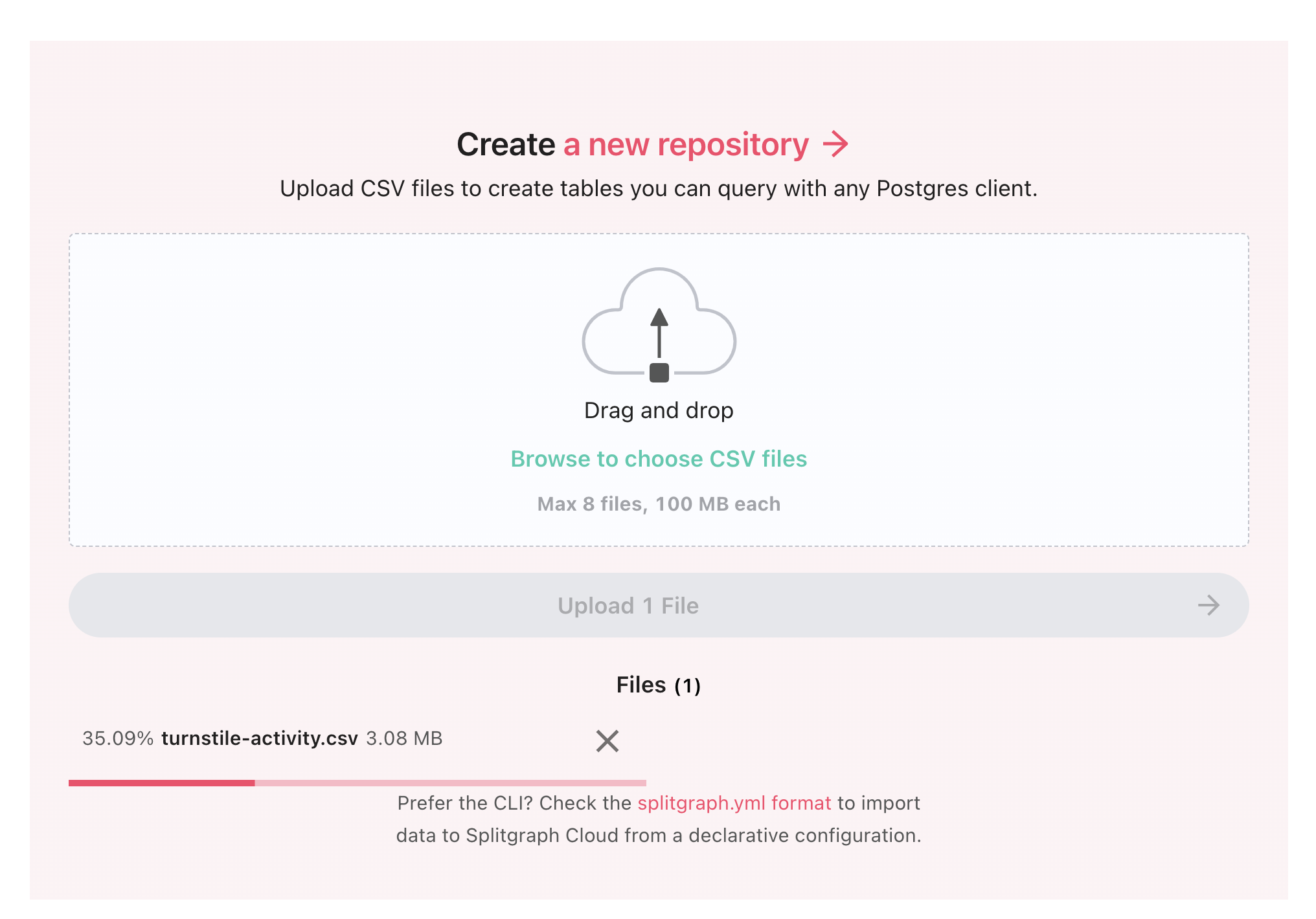 Drag and drop the CSV
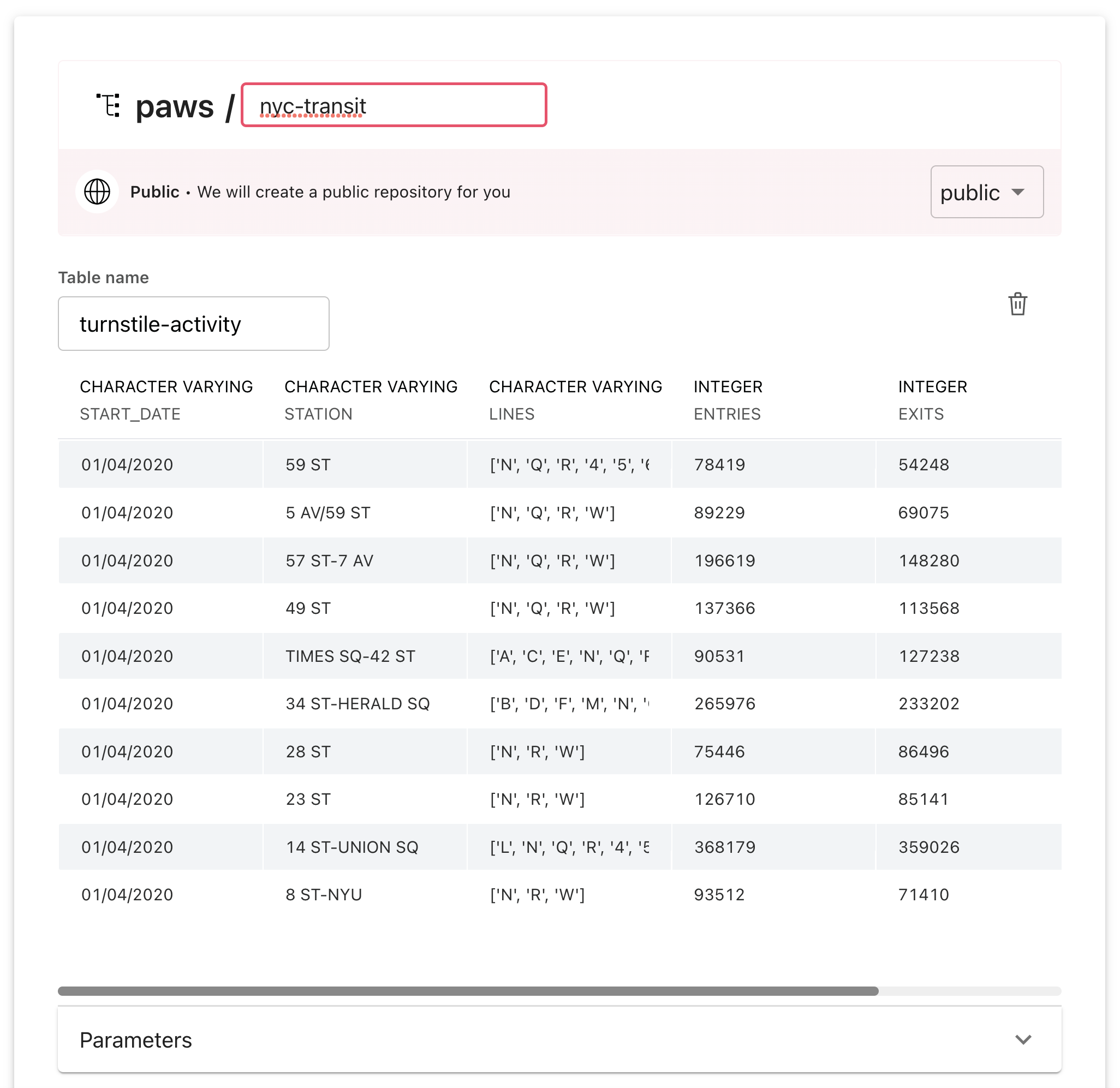 I went with "nyc-transit" for a repo name
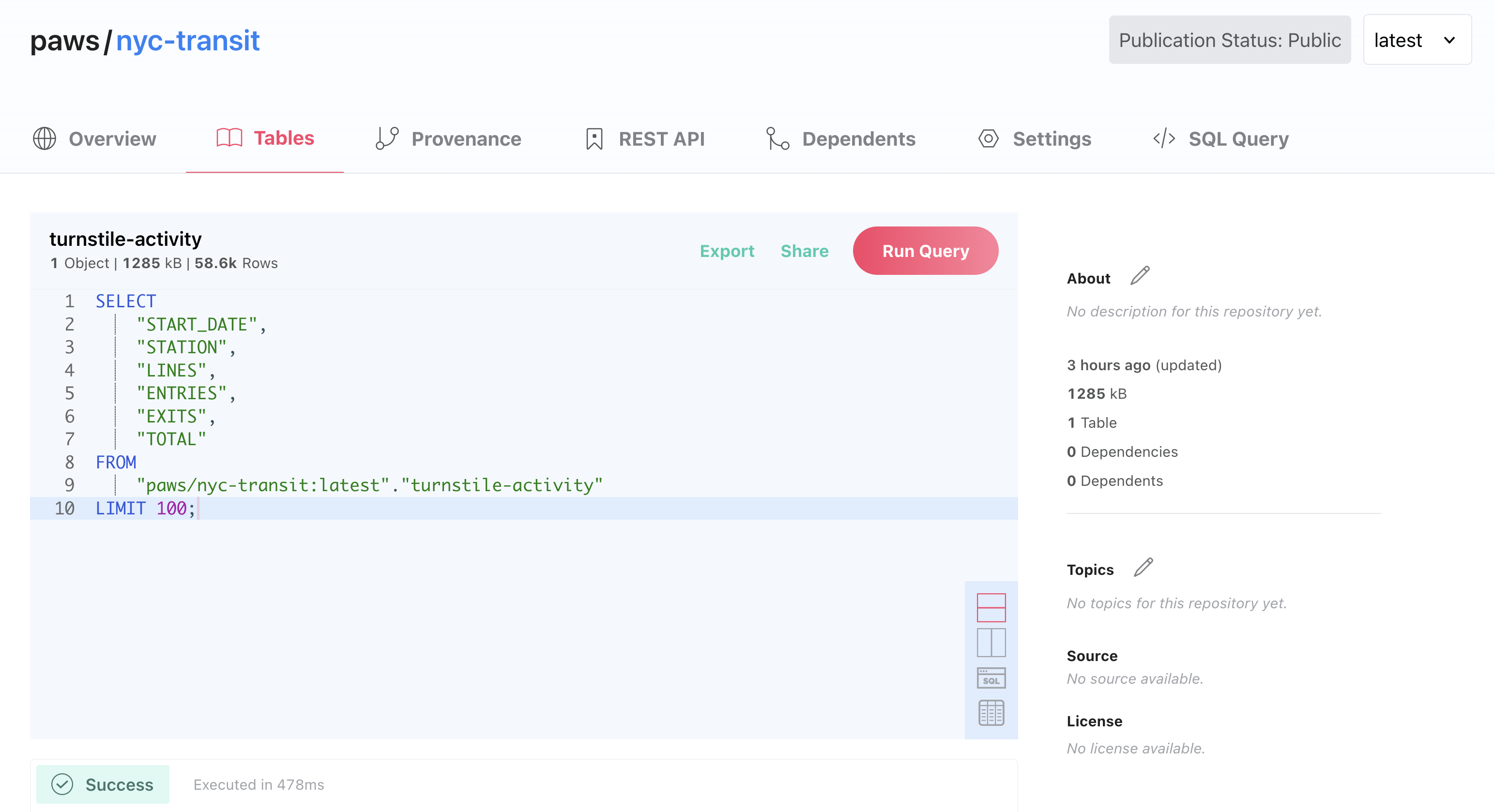 Repo page view
Upload a CSV to a Splitgraph repo: ✅
Let's query it!
With the repo now hosting the data, let's query it using SQL.
Here's a query for January 2020 turnstile activity:
DDN Time
For querying the repo in our app, we'll use the Splitgraph DDN. This feature makes repos conveniently available via postgresql://data.splitgraph.com:5432/ddn, and most Postgres clients should work. You will need a Splitgraph API key and secret to access the DDN; generate those by going to your account settings and set them aside.
The following example snippet will connect a Python app to the DDN. Swap user & password for the creds you just made.
conn = psycopg2.connect(
    user = "myuser",
    password = "supersecret",
    host = "data.splitgraph.com"
    port = "5432"
    database = "ddn"
)
If you prefer you can check out a working example repo at this step. Source - just add the creds to .streamlit/secrets.toml
Use SQL to query the repo: ✅
Enter Streamlit
Prefer an empty slate?
Streamlit has an example repo ready to clone/fork.
Handling aggregations and data cleanup with Python
We have all this data available to work with from the DDN. Now, let's write some Python to clean it up and prepare it for plotting. Let's do a simple aggregation so we can pass it into a Pandas DataFrame.
data = {"DATE": [], "TOTAL": []}
for k, v in totals.items():
    data['DATE'].append(k)
    data['TOTAL'].append(v)

source = pd.DataFrame.from_dict(data)
line_chart = alt.Chart(source).mark_line().encode(
        alt.X('DATE:T', title='Time'),
        alt.Y('TOTAL:Q', title='Weekly rides'),
    ).properties(title="MTA total weekly turnstile activity (Jan 2020-May 2022)")
The rest of the code is available.
Use Python to do basic aggregations: ✅
How to integrate Splitgraph with Streamlit
Streamlit lets Python developers write interactive dashboards, with sliders, inputs, and graphs, all without having to write a single line of JavaScript.
For example st.slider() will render a slider on the page whose value is available as a variable.
month = st.slider("Choose a month (Jan = 1, Feb = 2, etc.)", min_value=1, max_value=5)
Consider seeing the tag for a fleshed out example.
Tie it all together with Streamlit: ✅
Conclusion
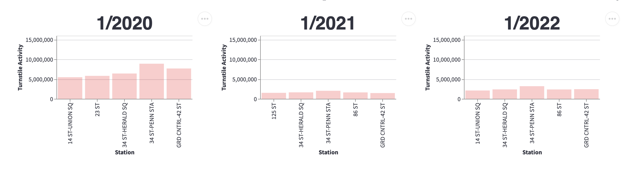
Is NYC back to business as usual? Well, take a look for yourself:
How about April?
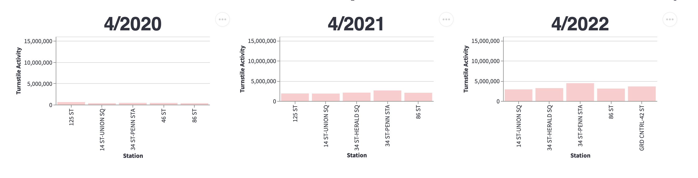
In sum, while we can see popular stations are getting more traffic than the early days of lockdown, so far turnstile activity in 2022 hovers around 50% of the same month in 2020.
The actual dashboard has mouseover with specific #s.
Recap
We started with a simple dataset, uploaded it to a Splitgraph repo so we could run SQL queries. Then, by writing some basic Python, we powered a mini dashboard by utilizing Streamlit's rich UI features. We didn't need to stand up any new infra, and our users are empowered to draw their own conclusions.
Shoutouts & Acknowledgements
Thank you MTA for regularly publishing turnstile data
Thank you @je2538, which is how I learned that the MTA offers this, and who (I believe) rolled up the data in a suitable format for this exercise.
Thank you Streamlit for making it easier to serve a rich client UI from Python.
Splitgraph
Made with


on four continents.